Resources
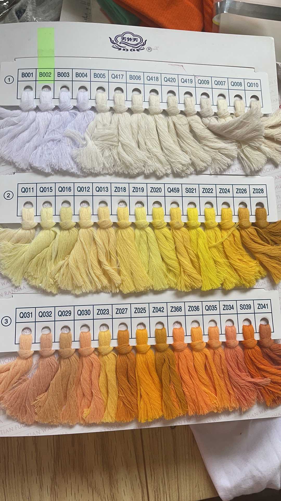
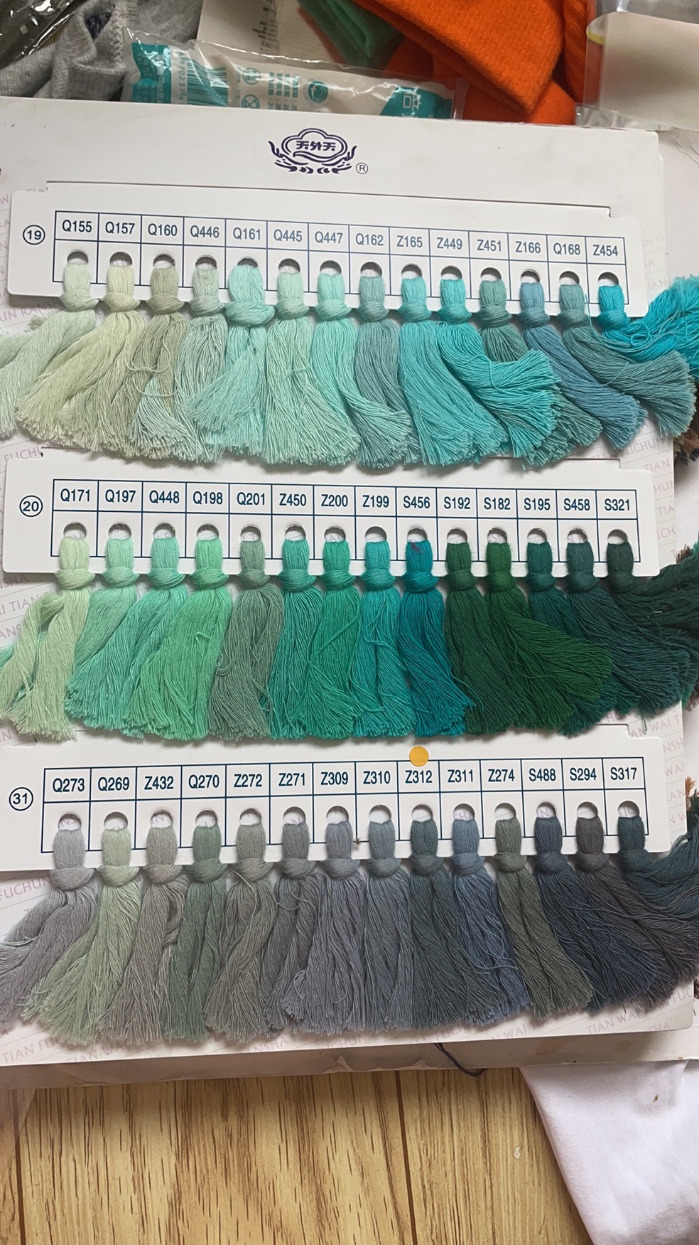
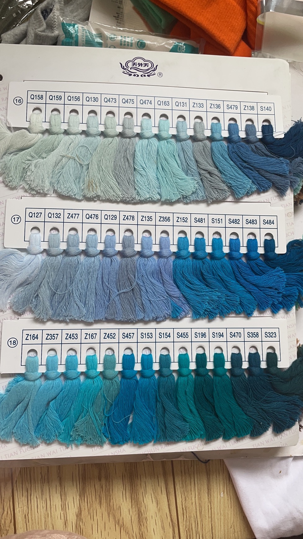
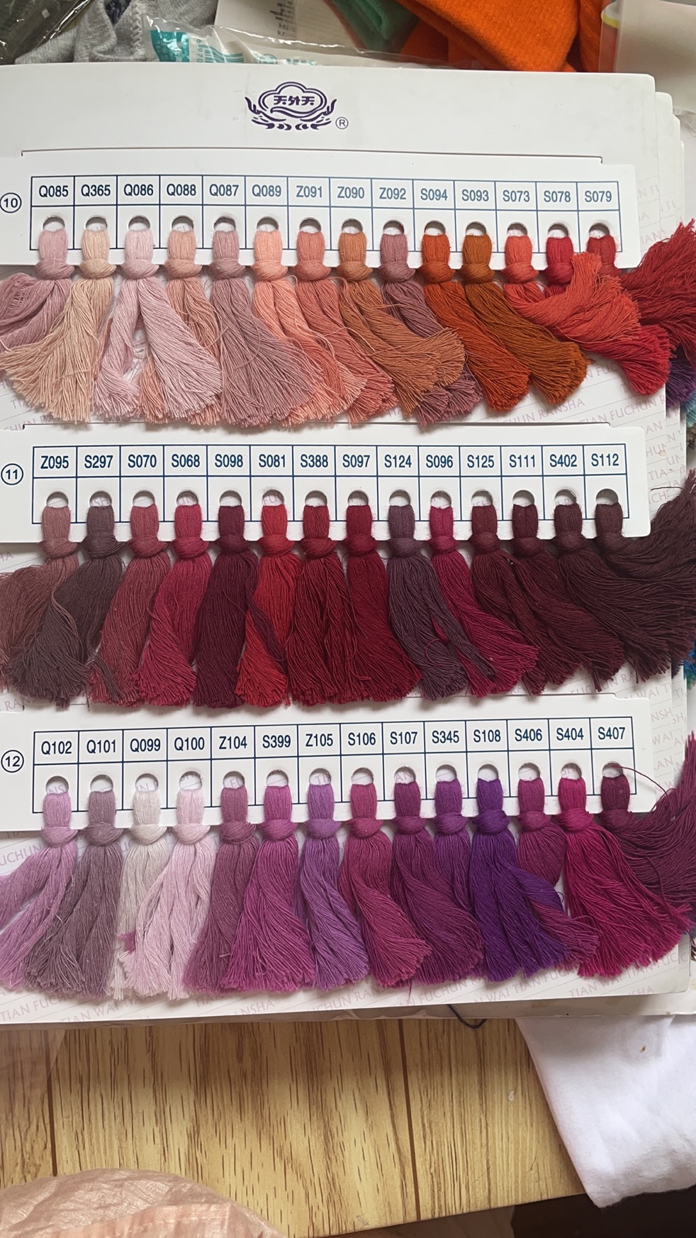
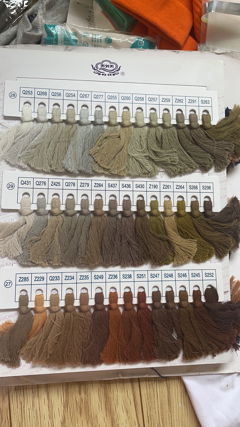
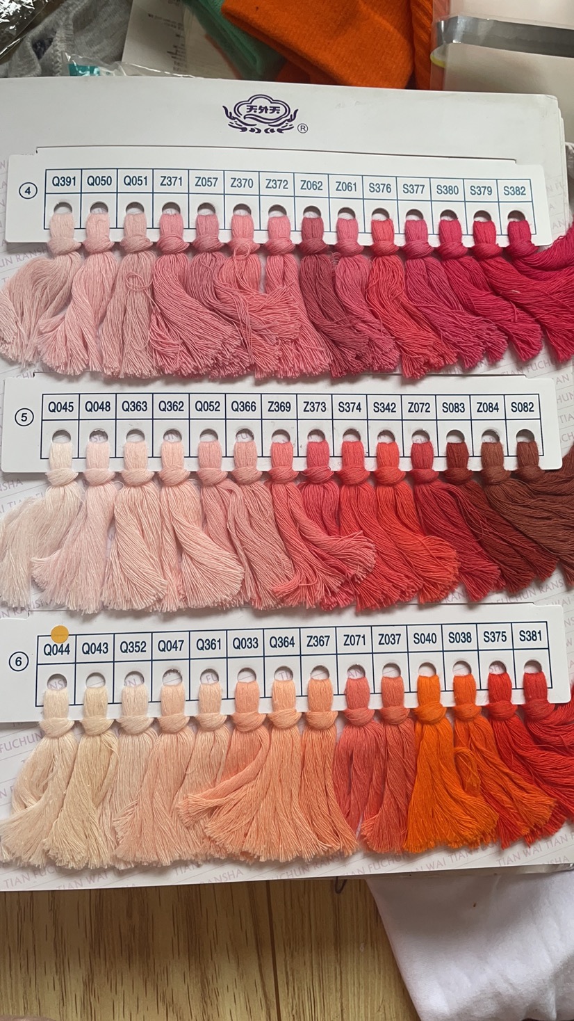
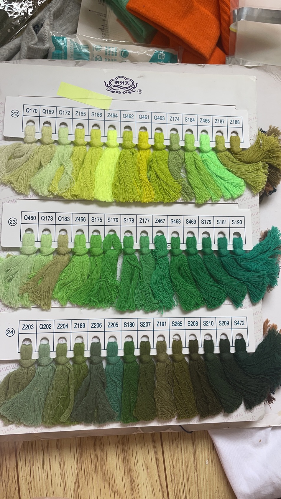
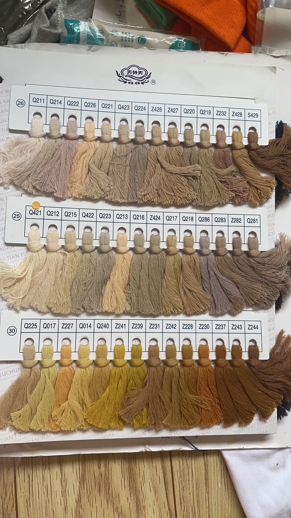
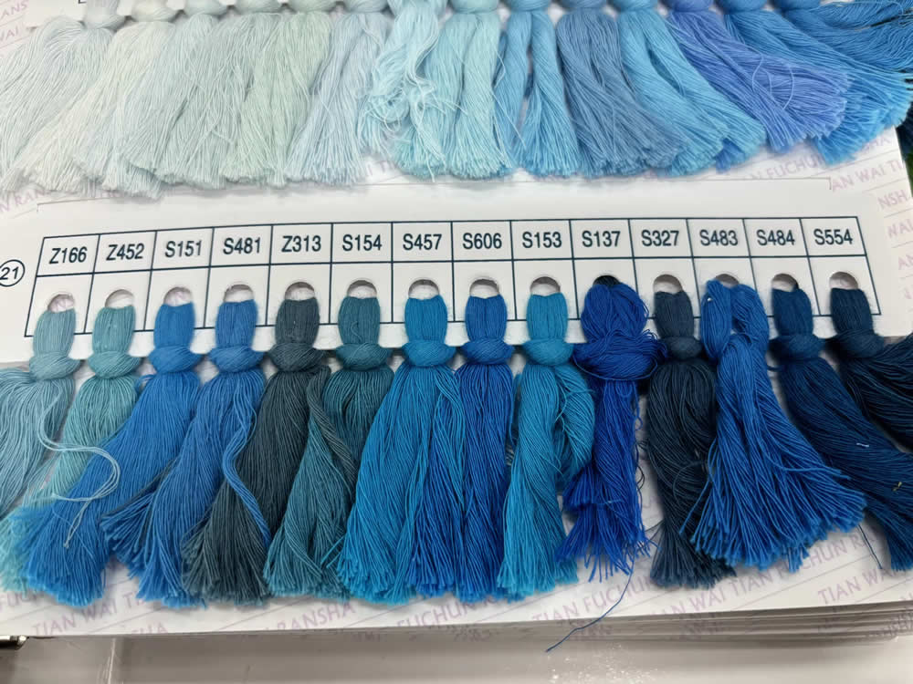
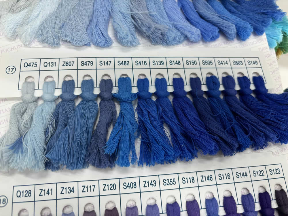
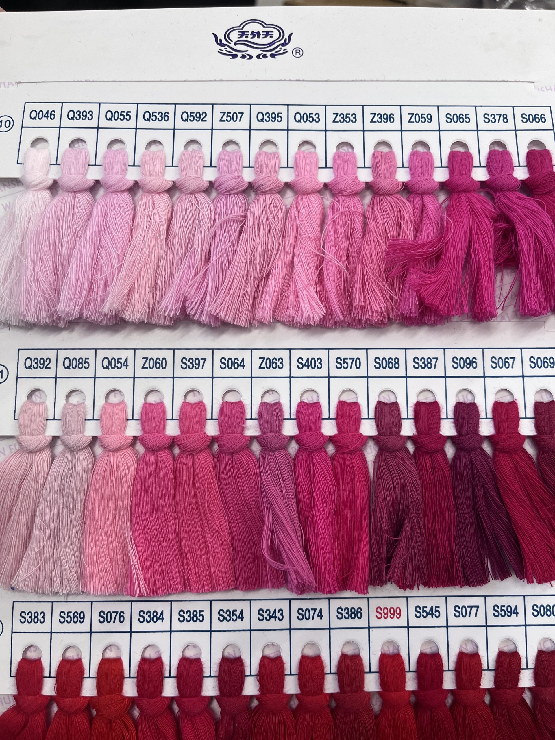
How to Choose Colours
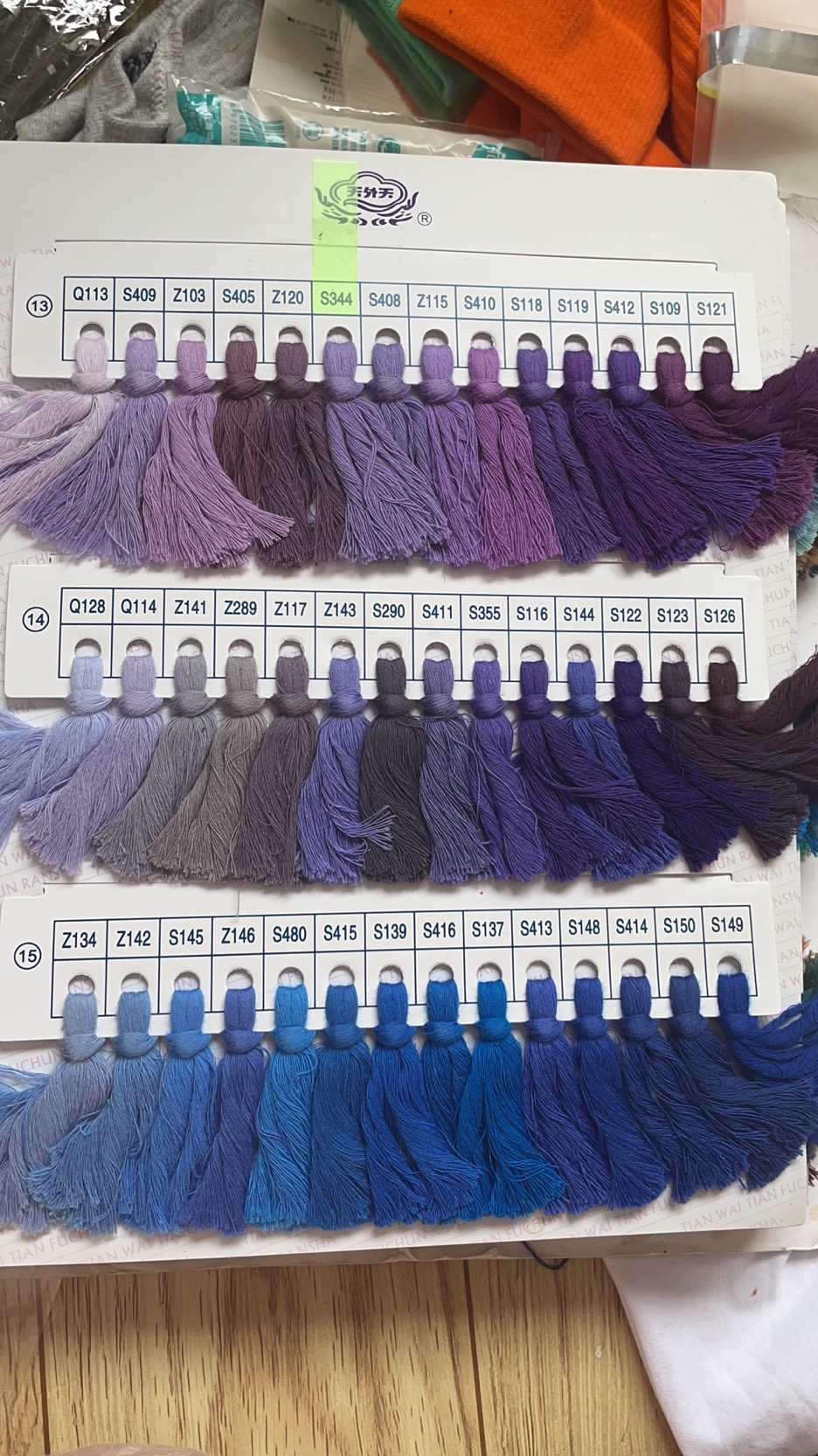
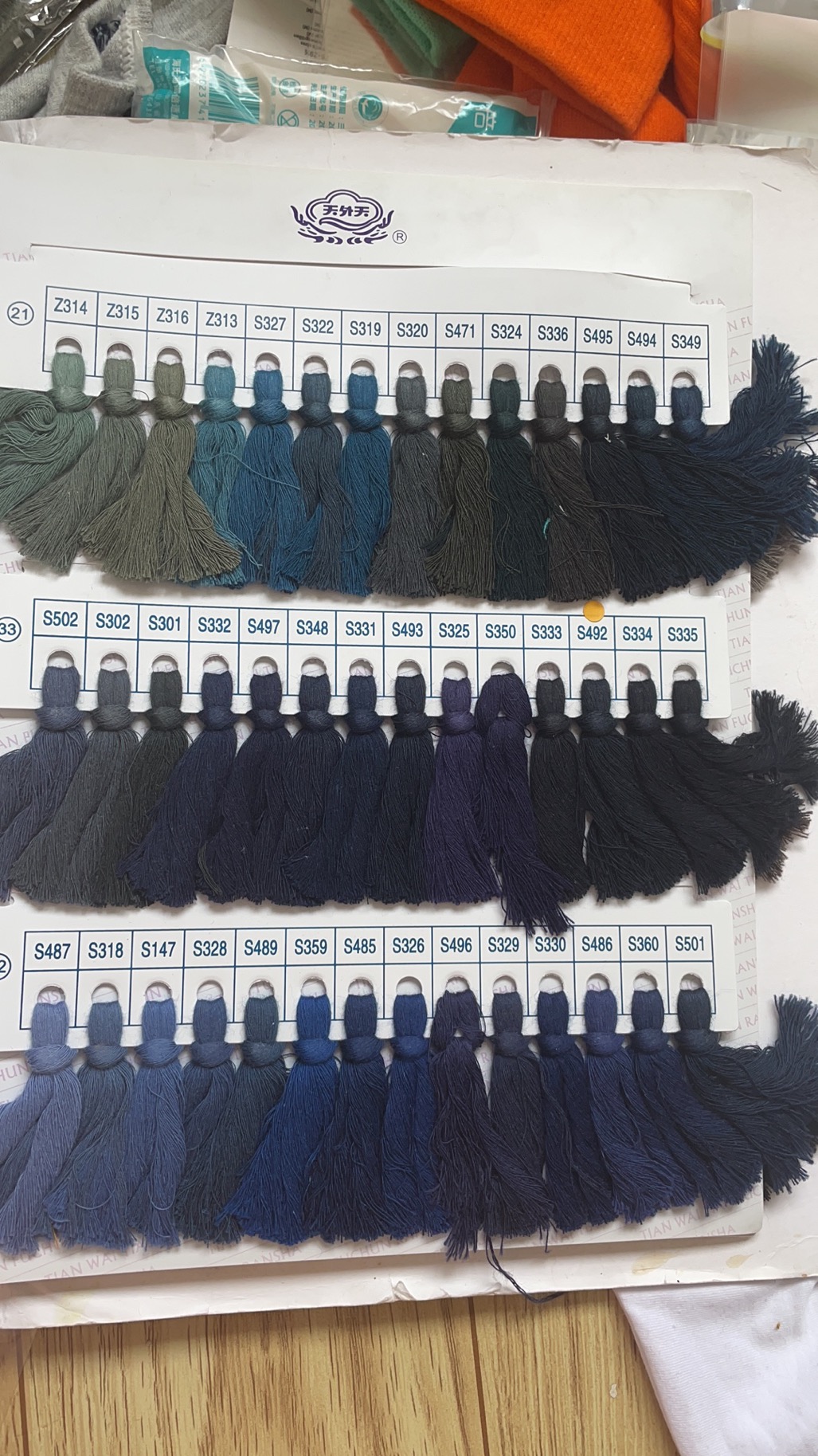
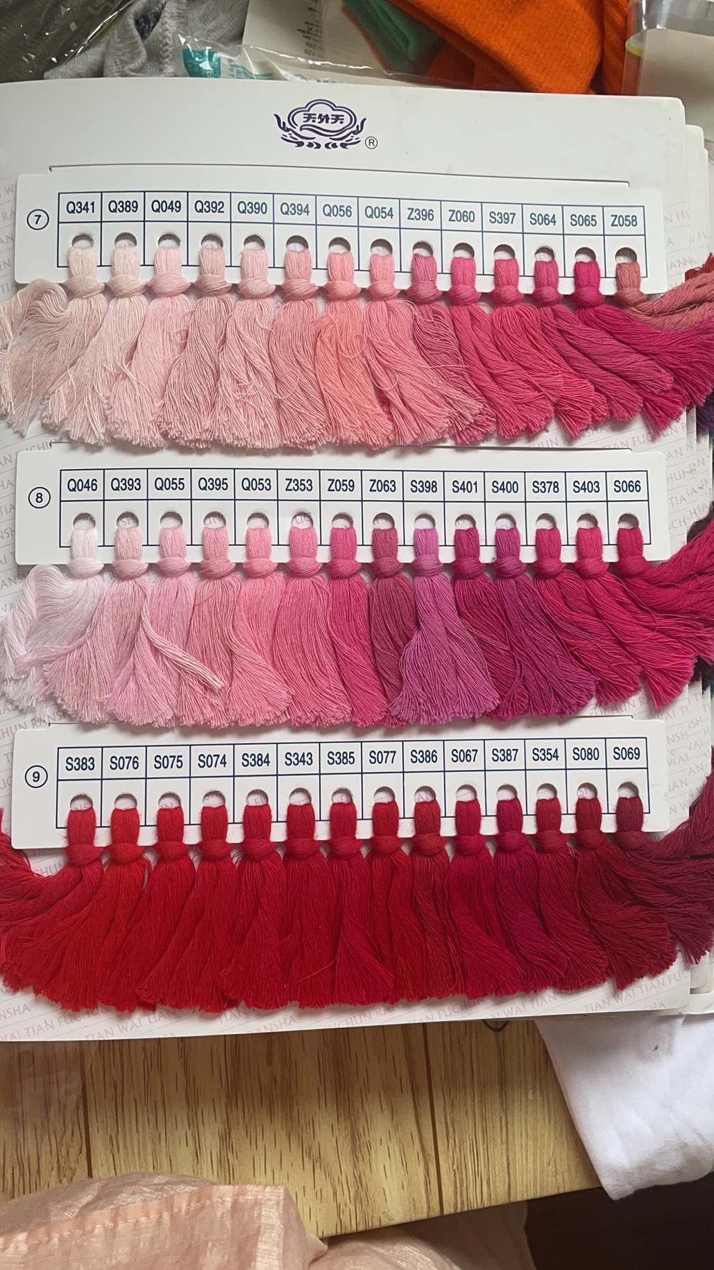
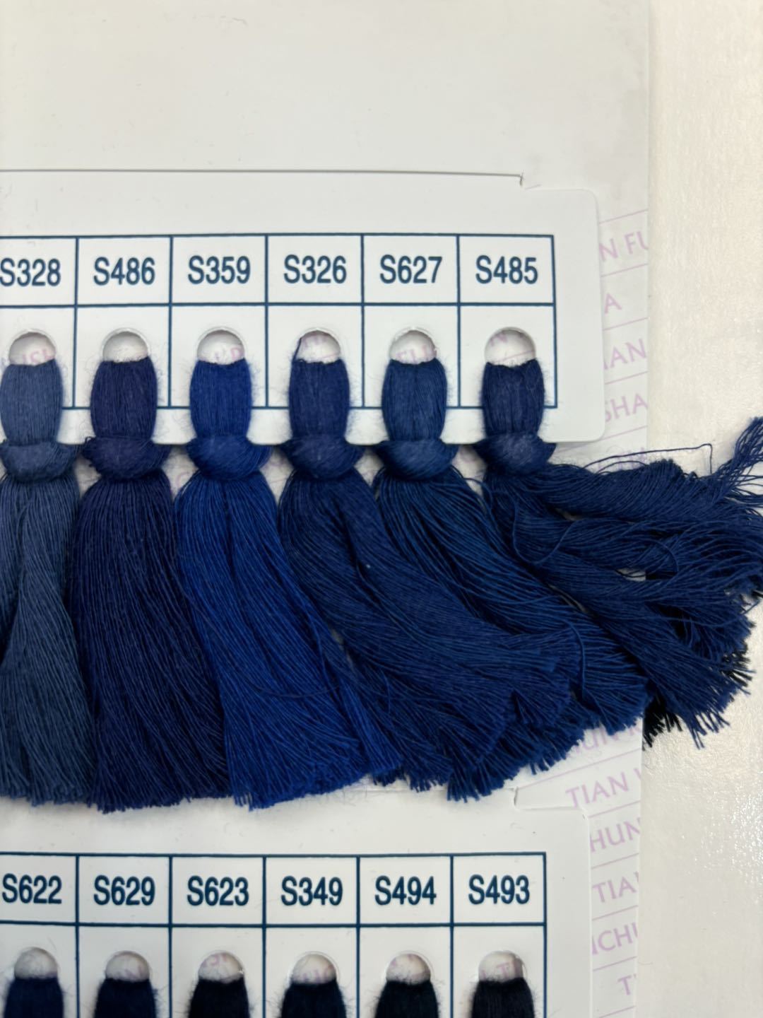
Choosing colors for custom socks is one of the most fun parts of the design process, but it helps to think beyond just picking your favorite shade.
Start with the purpose of the socks — bold, high-contrast colors tend to work well for team uniforms or brand merchandise since they stand out and stay recognizable even from a distance, while softer or neutral tones are often better suited for everyday casual wear or gifts.
Consider how the colors will look against the base fabric and any logos or patterns you’re adding, since certain color combinations can wash out details or make text hard to read. It’s also worth thinking about pairing: complementary colors (opposite each other on the color wheel) create vibrant contrast, while analogous colors (next to each other) give a more subtle, cohesive look. If you’re designing for a brand, matching your official brand colors (using hex or Pantone codes if your manufacturer supports them) will help keep the socks consistent with your other merchandise.
Finally, ordering a sample or digital proof before full production is a good way to confirm the colors look the way you expect, since screen colors don’t always translate exactly to printed or knitted fabric.